Think of the dreamy pinks and greens of La La Land and the shadow blues that haunt The Dark Knight. These looks didn’t just happen; they were designed.
That’s what color grading does. It transforms raw footage into atmosphere. Through hues, contrast, and light, you feel tension, romance, and nostalgia.
What you need to know about color gradings is:
- Color Theory in Film: Shadows, midtones, and highlights work together to guide mood and storytelling.
- Essential Tools: DaVinci Resolve and color-accurate monitors are essential, along with LUTs for efficiency and consistency.
- Grading Workflow: Begin with RAW footage, correct colors, match shots, refine skin tones, apply grading, and finalize quality control.
- Genre-Based Colour Palettes: Each genre has a style (teal-orange for action, muted tones for drama, desaturation for horror)
- Platform-Specific Grading: Adjust your cinema, streaming, or social media grade based on screen type, color space, and viewing environment.
- Best Practices: Maintain visual style, preserve skin tones, balance contrast, and avoid over-grading.
Fundamental Concepts of Colour Grading
At its core, color grading is the process. It works to enhance or alter a film’s color after being shot. You can say that color grading gives a final touch to bring out the desired visual tone and mood.
Think of it like this:
- Color correction comes first. It fixes issues like white balance, exposure, and contrast.
- Color grading comes after. It adds style, atmosphere, and emotion.
Some basics:
- You can change the colors to warmer or cooler depending on the scene.
- You can isolate specific colors to make certain elements pop.
- You can create contrast to add drama or flatten tones for a softer look.
Understanding Colour Theory for Film
This is where things get creative and psychological.
[Source: Colors in Filmmaking | FILMMAKERS ACADEMY]
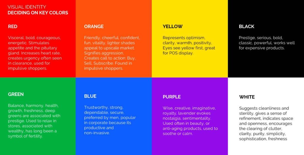
- Warm colors (reds, oranges, yellows): It means energy, passion, warmth, and sometimes aggression.
- Cool colors (blues, greens, purples): Portrays calm, sadness, mystery, isolation.
- Monochromatic, analogous, complementary, and triadic create different levels of visual harmony or tension.
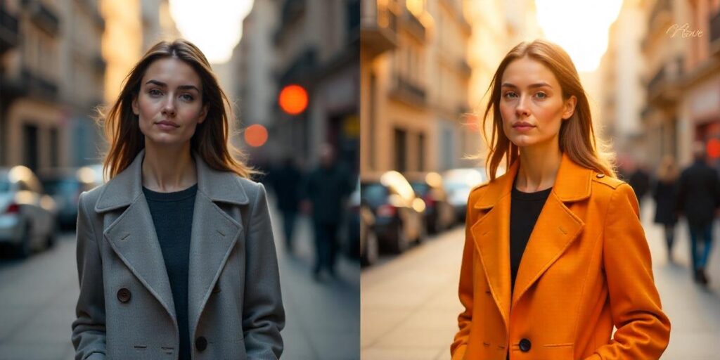
Blockbuster movies often use teal and orange. Teal for shadows and range for skin tones. It’s a combo that works!
The Role of Shadows, Midtones, and Highlights
Think of an image in three layers:
- Shadows: The darkest parts. These set depth and mood. Changing color affects a scene’s grit or mystery.
- Midtones: The middle range. The detail lies (like skin tones). Adjusting these maintains a natural or stylized feel.
- Highlights: The brightest areas. Use it for dramatic sunlight, and full back for softness.
How Does Colour Influence Mood and Emotion in Film?
Color connects with us on a gut level. Filmmakers use this to their advantage.
Some classic examples:
- Blue grading for sad or lonely scenes (like in Blue Valentine).
- Green tints in thrillers or dystopias (think The Matrix).
- Yellow-orange glow for warmth or nostalgia.
Essential Tools and Software for Colour Grading
Color grading greatly depends on reliable software. You may even use LUT (Look-Up Table) to achieve color consistency in the film sequence.
Industry-Standard Software
You don’t have to be a pro or a newbie to get the scoop on this color-grading software. Here are the top names in the color grading game:
DaVinci Resolve
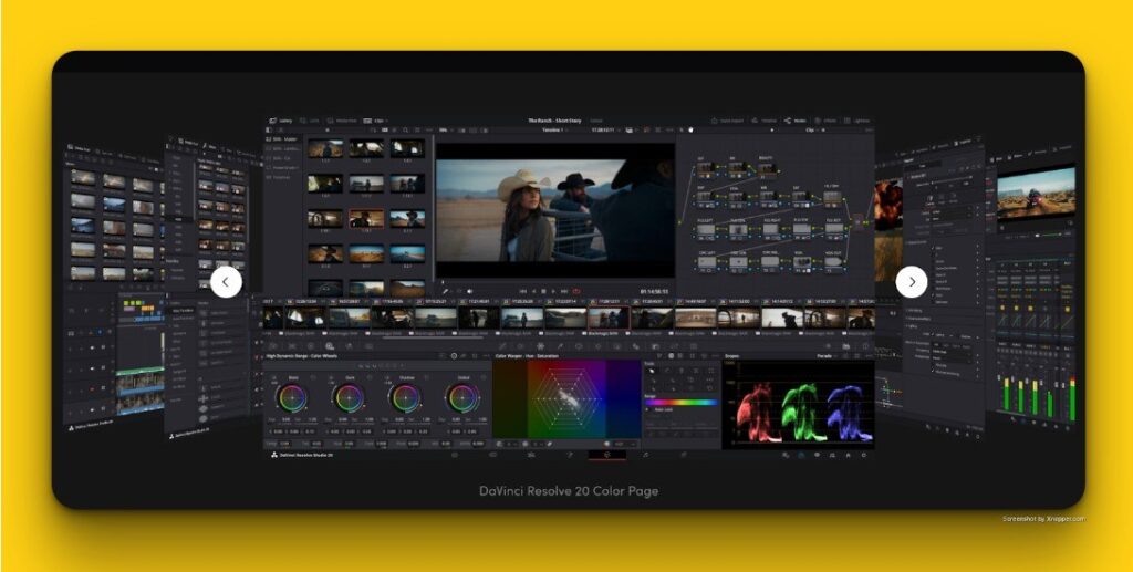
[Source: DaVinci Resolve]
- The gold standard for color grading in the industry
- Offers a free version with powerful tools
- Perfect for beginners and pros alike
- Supports 32-bit image processing
- It’s a full editing suite
- You can cut and grade in one place
- Advanced color wheels, node-based grading, tracking, and much more
Adobe Premiere Pro
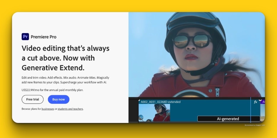
[Source: Adobe Premiere Pro]
- More of a full video editing software
- Solid Lumetri Color tools for basic to intermediate grading
- Cliders, curves, color wheels, and support for LUTs
- Great for editors who want to do everything in one program
- Integrates with After Effects and Photoshop for workflow flexibility
Baselight
[Source: Baselight 6.0]
- A high-end, professional color grading system
- Used in big studios and feature films
- Powerful but costly, typically in post-production
- Not beginner-friendly, but worth knowing if you aim for the top
Hardware Recommendations
You don’t need a fancy studio to get started. However, the right hardware makes a huge difference.
Monitors
- Invest in a calibrated monitor with good color accuracy
- Budget-friendly options: BenQ PD Series or Eizo ColorEdge.
- Avoid grading on uncalibrated laptop screens
Color Panels
- These physical control surfaces enable faster and more intuitive grading.
- Popular options include Design DaVinci Resolve Panels (Mini, Micro, Advanced) and Affordable (Tangent Ripple or Wave).
Using LUTs (Look-Up Tables)
LUTs are like pre-made color recipes you can apply to your footage. The math tables are used to tweak colors in videos. They help you work faster and keep things looking the same from shot to shot.
Types of LUTs:
- Technical LUTs: Used for converting log footage to raw profiles
- Creative LUTs: Apply specific color styles or looks (add mood, color style, or cinematic looks).
How to Use LUTs:
- Load them into your software’s color panel
- Use LUTs as a starting point
- Tweak the grade to suit your footage
- Think of them as a base, not a finish line.
Relatable Reads: 10 Essential Multi-Camera Shooting Techniques for Pro Shoots – LocalEyes
Step-by-Step Colour Grading Workflow
Here we have made a step-by-step workflow for you. It will maximize flexibility, consistency, creativity, and quality control in your footage.
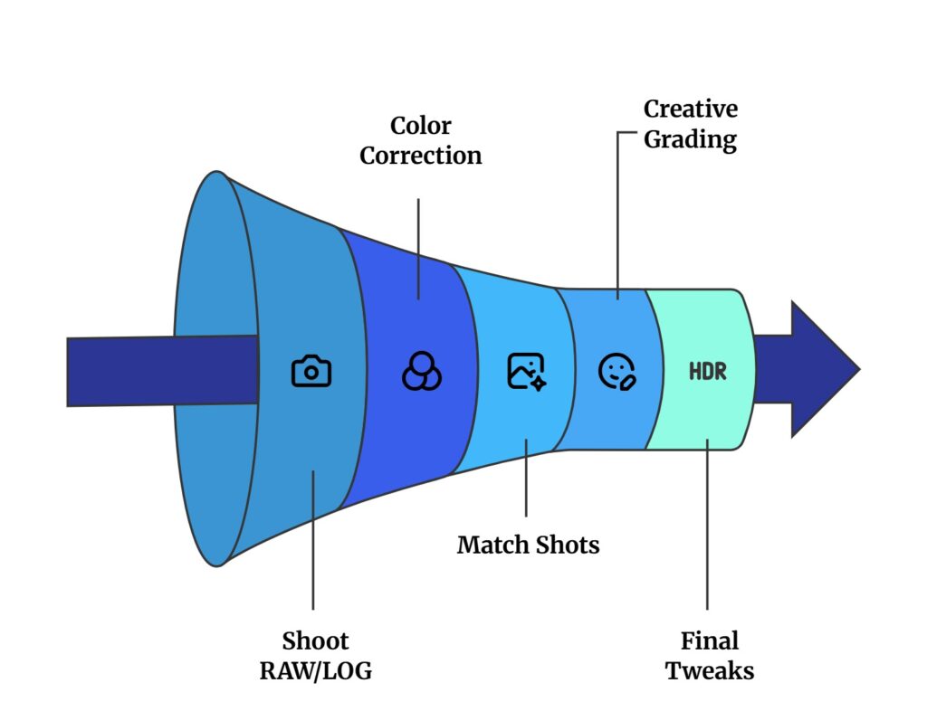
Step 1: Shoot in RAW or LOG for Maximum Flexibility
- Capture with RAW or LOG Format: RAW and LOG formats capture a wider dynamic range and more color information. It gives you way more room to adjust shadows, highlights, and tones.
- Understand Your Camera’s Color Space: Understand your camera’s acquisition color space to improve workflow and deliverables, usually Rec.
Step 2: Colour Correction (Establishing a Neutral Base)
Before getting creative, you want to ensure your footage looks natural and technically correct.
Focus on:
- Fixing white balance (cooler or warmer)
- Adjusting exposure and contrast
- Correct any unwanted color tints
- Balancing RGB channels so whites are white and blacks are black
Use tools like:
- Waveform monitors to check exposure levels
- Vectorscopes to monitor color shifts
- RGB Parade to balance colors
Step 3: Shot Matching and Skin Tone Consistency
Once all your clips are corrected, you want them to feel like they belong together. It is more like they’re from the same scene and environment.
- Match the lighting, temperature, and saturation levels between shots
- Use power windows or masks to isolate and fine-tune faces
- Pay close attention to skin tones
- Use split-screen comparisons and presets or LUTs for easier matching
Step 4: Creative Colour Grading to Set Mood and Style
Now the fun begins. Start adding mood, emotion, and character to your scene.
You can:
- Choose a color palette that goes with the story’s emotions
- Push shadows to cooler tones or highlights to warmer tones
- Shift mid-tones to bring out specific emotions
- Add a cinematic contrast curve or color wheels
- Apply stylized color themes
- Try out LUTs to effortlessly achieve consistent stylistic looks
- Add grain, vignette, or effects for a cinematic feel
Step 5: Final Tweaks, Applying LUTs, and Quality Control
This is where you polish everything and prep for export.
- Apply creative LUTs for extra style (optional)
- Add a vignette or sharpen slightly (don’t overdo it)
- Zoom in and check for artifacts, banding, or weird color shifts
- Watch the full timeline to spot any inconsistent shots
- Export the final graded footage in the chosen color space
Double-check:
- How it looks on different screens (monitor, phone, TV)
- How it sounds (if you’ve done sound mixing too)
Check out How to Storyboard? – Step-By-Step Ultimate Guide for 2025 – LocalEyes
Best Practices for Cinematic Colour Grading
Going for a cinematic color grade can be difficult. This is why you should try to follow the best practices. They will help you stay consistent, tell a strong visual story, and avoid common pitfalls.
Maintain a Consistent Visual Style Across Scenes
Cinematic color grading isn’t just about making each shot look good. It’s more about making the whole film feel unified.
Tips:
- Use reference stills or a mood board to guide your grade
- Create and apply a base grade or LUT across the timeline
- Match lighting, white balance, and contrast across shots
- Create a workflow pipeline
Pay Special Attention to Skin Tones
Skin tones are sacred in color grading. If they look unnatural, the audience feels it instantly.
What to do:
- Use the vectorscope to keep skin tones on the “skin tone line.”
- Avoid making skin tones overly red, green, or magenta
- Consider different skin types and lighting
- Use power windows or masks to isolate faces when needed
Balance Contrast, Saturation, and Exposure
These three pillars are key to a professional-grade image. Too much or too little of anyone, and the grade falls apart.
Balance guide:
- Contrast gives your image depth and pop
- Use curves instead of just dragging sliders
- Saturation should enhance the emotion but never distract
- Avoid mixing out saturation
- Try adjusting per color channel instead of globally
- Exposure needs to be just right
Avoid These 4 Common Colour Grading Mistakes
Here are a few things that often trip up even intermediate editors:
Mistake 1: Over-Grading
- Excessive LUTs, curves, or color wheels can make the footage look unnatural, plastic-looking images.
Mistake 2: Ignoring Scopes
- Trusting your eyes alone can be risky. RGB Parade, Histogram, and Vectorscope are your safety net.
Mistake 3: Skipping Shot Matching
- You can have a beautiful grade on one shot. However, if it doesn’t match with the next one, it breaks the immersion.
Mistake 4: Forgetting the Story
- Color should support the narrative, not show off your skills.
You can also check out the Top 7 Cinematic Lighting Techniques Every Filmmaker Should Know.
Color Grading by Film Genre and Theme
There are some actual examples of how color grading changes the whole mood of the room. You can see how a specific color scheme can portray what genre or what you are about to expect on the screen.
Using Colour Palettes to Enhance Genre-Specific Storytelling
Every genre has a “visual language”, and the color is a big part of that.
Why it matters:
- Colour helps set expectations
- It evokes emotion before the characters even speak
- It can subtly signal themes, periods, or psychological states
Some key tools:
- Hue: The actual color used (blue, red, green, etc.)
- Saturation: How intense or muted the colors are
- Contrast: The difference between light and dark areas
- Color harmony: Choosing colors that work well together (complementary or analogous)
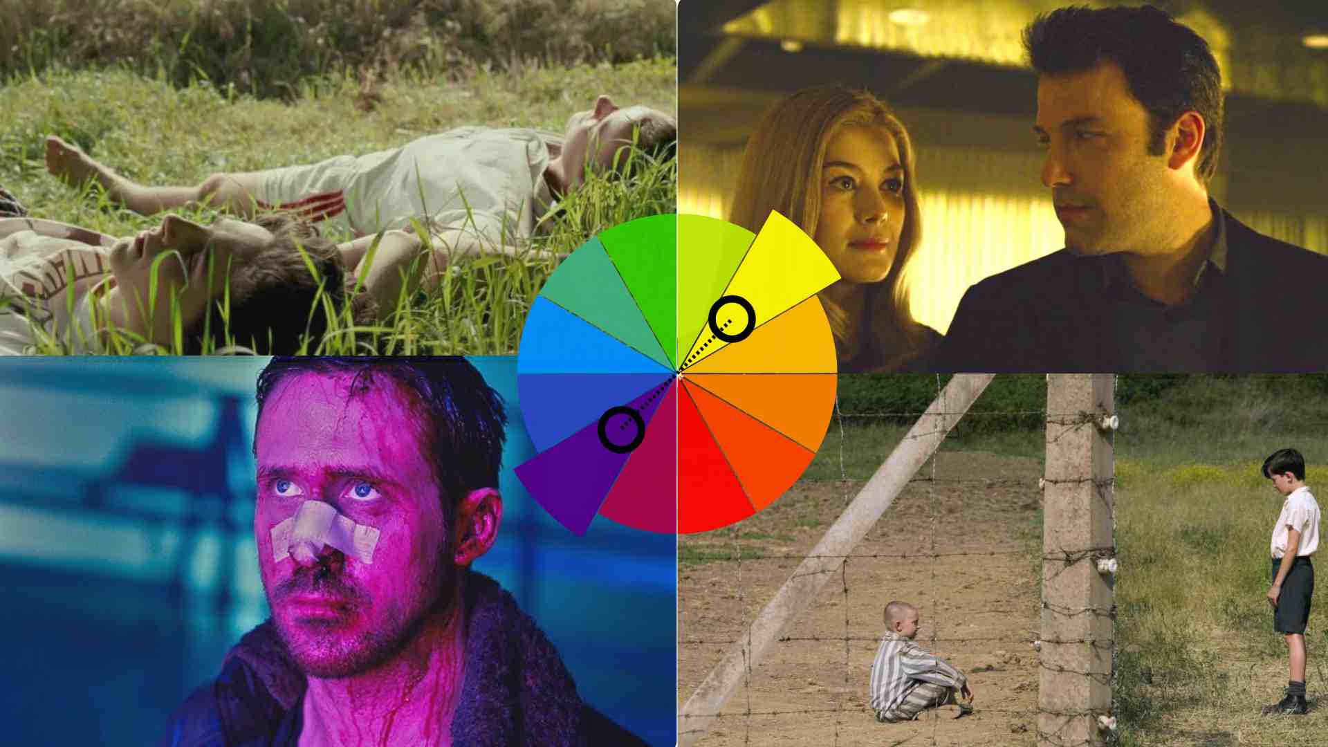
Examples by Genre
Action/Adventure: Teal and Orange

[Source: Transformers]
- Why it works: Skin tones are orange, and shadows and skies are teal. This creates contrast and visual punch.
- Effect: High energy, cinematic tension, and vibrancy.
- Used in: Transformers, Iron Man, Mission: Impossible
Drama: Muted, Natural Tones
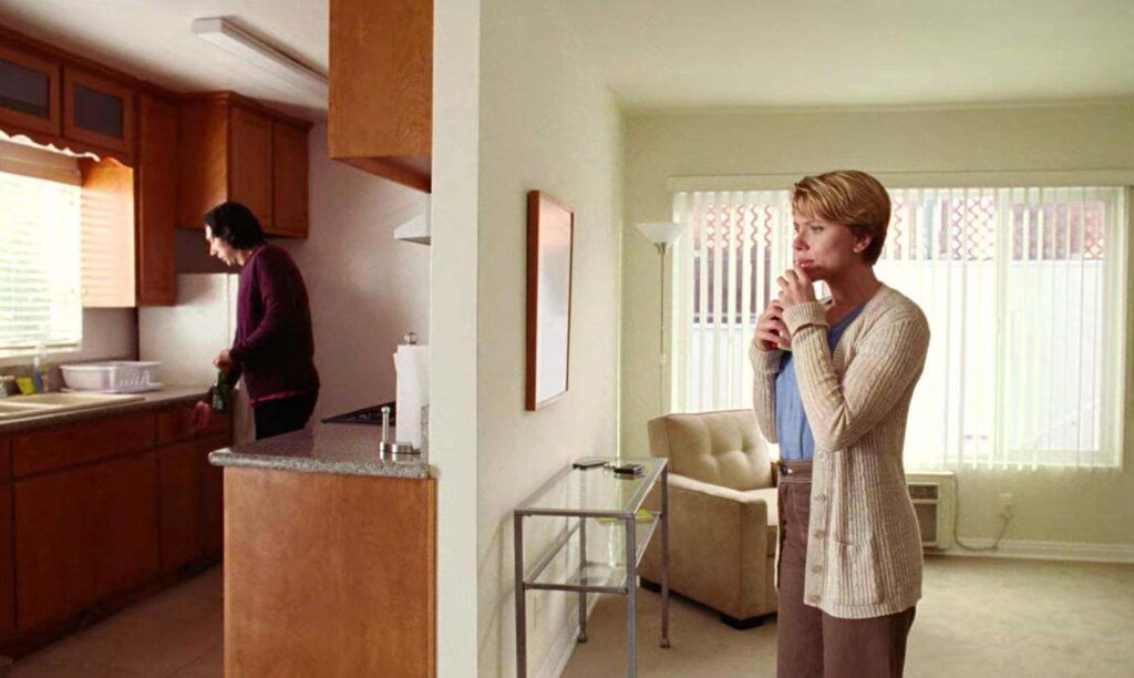
[Source: Marriage Story]
- Why it works: Keeps the focus on the characters and emotions.
- Effect: Realism, intimacy, subtle tension.
- Used in: Marriage Story, The Social Network, Lady Bird
Horror: Desaturated and Cool Tones
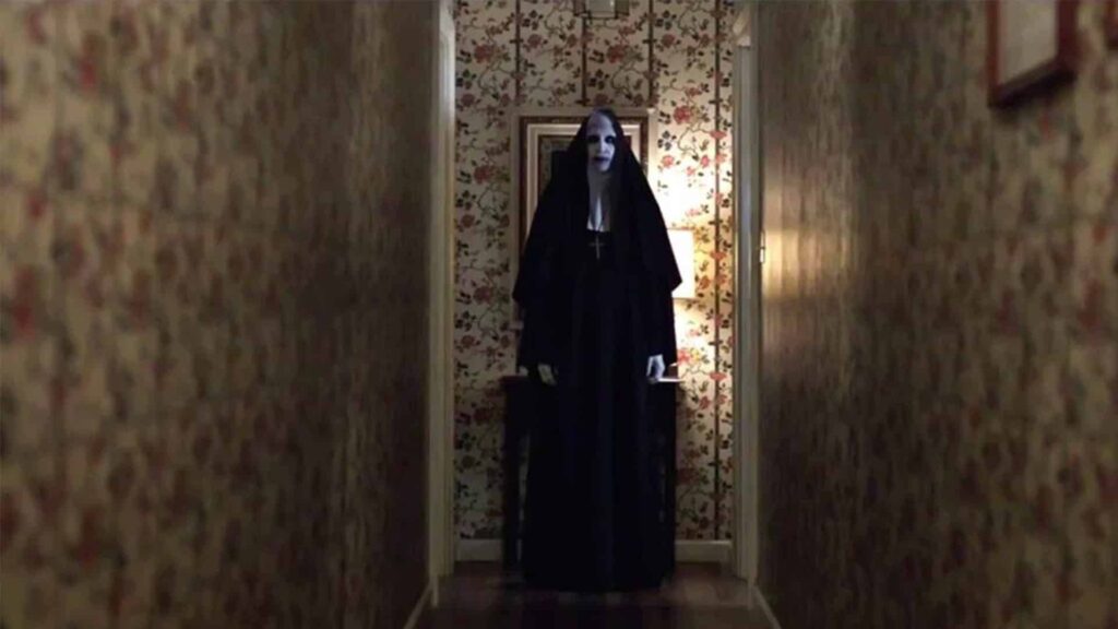
[Source: The Nun]
- Why it works: Cool colors create unease. Less saturation makes scenes feel lifeless or eerie.
- Effect: Dread, isolation, suspense.
- Used in: The Conjuring, Hereditary, The Witch
Sci-Fi: Neon, High Contrast, Synthetic Palettes

[Source: Blade Runner 2049]
- Why it works: Feels futuristic, artificial, and “otherworldly.”
- Effect: Awe, surrealism, alienation.
- Used in: Blade Runner 2049, Ex Machina, Annihilation
Post-Apocalyptic: Dusty, Warm, Washed Out
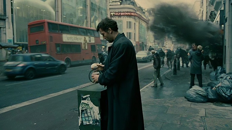
[Source: Children of Men]
- Why it works: Suggests heat, decay, dryness, and chaos.
- Effect: Tension, survival, desolation.
- Used in: Mad Max: Fury Road, Children of Men
Fantasy: Rich, Saturated, Storybook Hues
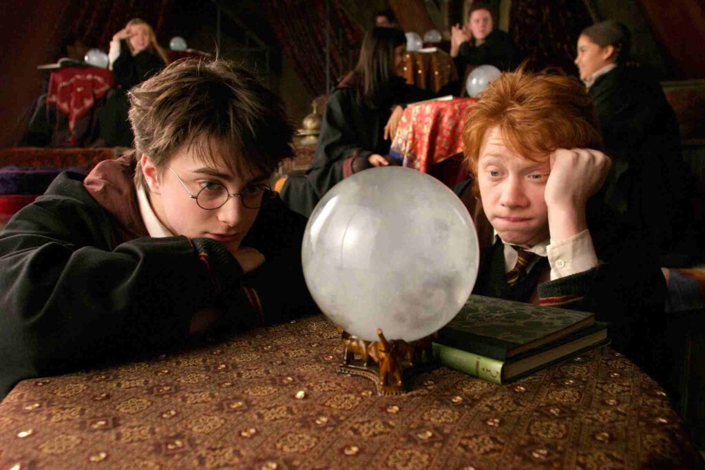
[Source: Harry Potter the Prisoner of Azkaban]
- Why it works: Heightens magic and wonder.
- Effect: Escapism, beauty, enchantment.
- Used in: Harry Potter, The Chronicles of Narnia, The Green Knight
Relatable Reads: Green Screen vs. Blue Screen: Which One Do You Need? – LocalEyes
Case Studies from Popular Films
Mad Max: Fury Road

[Source: Mad Max: Fury Road]
- Palette: Highly saturated oranges and blues.
- Purpose: Creates chaos and adrenaline. The warm tones reflect the brutal desert, while blue-toned night scenes offer a brief visual “cool-down.”
Joker (2019)
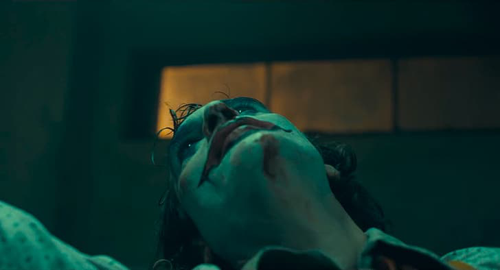
[Source: Joker (2019)]
- Palette: Muted, vintage hues with green, mustard yellow, and sickly teals.
- Purpose: It reflects the character’s mental state. It is uncomfortable but oddly beautiful.
Optimizing Colour Grading for Different Distribution Platforms
You can’t just stick to one color grading for every platform. You will need to fit into the specific technical and viewing conditions.
Theatrical vs Streaming vs Social Media Requirements
Each platform has different technical standards and viewing conditions, so your grading approach should adapt accordingly.
Theatrical Release (Cinema)
- High dynamic range and wide color gamut (typically DCI-P3 space)
- Dark, controlled viewing environment
- The footage is usually mastered in 4K, 2K, or HDR formats with a high bit depth
- Grading is subtler in a theatre with rich visuals and contrast
Streaming Platforms (Netflix, Amazon, YouTube, etc.)
- Content is viewed on everything from OLED TVs to budget LCDs to tablets.
- Target delivery is typically Rec. 709, but HDR formats like Dolby Vision and HDR10 are more common.
- Must account for both high-quality TVs and compressed streams.
Social Media (Instagram, TikTok, Facebook)
- Often viewed on mobile devices in bright, uncontrolled lighting.
- High contrast, punchy colors, and strong midtones tend to work best.
- Platform-specific aspect ratios (e.g., vertical for TikTok) can crop framing.
Check out Vertical Video for Social Media: Best Practices for Reels in 2025 – LocalEyes
Adapting Colour Grading for Various Screen Types and Environments
Not all screens are created equal. A subtle shadow detail on a calibrated monitor may vanish on a cheap TV.
How to adapt:
- Use a reference monitor that supports Rec. 709 (or P3 if working in HDR).
- Check your grade on a smartphone, TV screen, or laptop.
- Use broadcast-safe checks to prevent clipping on low-quality screens.
The Role of Feature Film Mastering & Delivery in Colour Accuracy
After grading, mastering, and delivery, keep your colors consistent across platforms.
Mastering includes:
- Final exports in high-bit depth formats for cinema/streaming.
- Encoding for delivery formats (MP4 for web, DCP for theaters, IMF for Netflix).
- Ensuring color metadata (like Rec. 709 or Rec. 2020) is embedded correctly.
Frequently Asked Questions: Color Grading in Film
What is the best color grade for cinematic video?
How to color grade a cinematic?
What is the best format for color grading video?
What is a cinematic LUT for color grading?

Founder at LocalEyes Video Production | Inc. 5000 CEO | Emmy Award Winning Producer