In 2026, SaaS explainer videos are no longer optional; they’re a core growth asset. As competition intensifies and attention spans shrink, companies must communicate value instantly and clearly. The right explainer video accelerates understanding, reduces friction in the buyer journey, and drives product adoption from the first touchpoint.
AI-powered scripting and production tools now enable faster iteration and smarter messaging. Short-form video dominates landing pages and social channels, delivering concise, high-impact storytelling. Personalization allows teams to tailor messaging by segment, industry, or use case at scale. And in a product-led growth environment, explainer videos bridge the gap between curiosity and activation, guiding users seamlessly from awareness to hands-on experience.
For modern SaaS brands, explainer videos are not just marketing tools, they’re conversion engines.
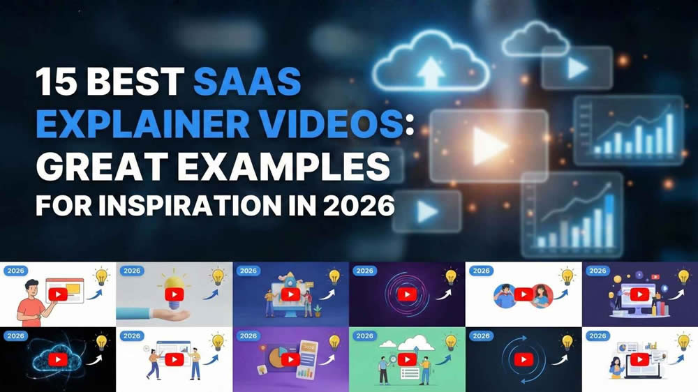
Existing Explainer Video Examples
This SaaS explainer video succeeds by clearly articulating the problem, demonstrating the product in action, and tying features directly to measurable outcomes. The messaging is focused, visually guided, and structured around real user pain points rather than generic claims.
It still works in 2026 because clarity converts. Even with AI-generated content and shorter attention spans, buyers prioritize fast comprehension and proof of value. The concise narrative and product-first approach align well with product-led growth strategies.
SaaS marketers can learn to simplify messaging, highlight outcomes over features, and design videos that accelerate activation, not just awareness.
1. Linear
Style: Minimalist product demo + motion UI
Why it’s effective: Opens with real interface interactions and uses subtle motion to emphasize speed and “keyboard-first” flow. The pacing mirrors the brand promise: fast, focused, frictionless.
What to learn from it:
- Show the interface within the first 5–10 seconds.
- Use micro-animations (highlights, zooms, cursor cues) to guide attention instead of heavy narration.
- Let responsiveness and workflow clarity serve as proof.
Key takeaway: Show the product early, then use editing and motion to make the experience instantly understandable.
2. Notion
Style: Story-driven product demo
Why it’s effective: Sells a way of working by grounding features in relatable scenarios (team wiki, project hub, planning). Features appear as natural tools inside a workflow narrative.
What to learn from it:
- Anchor features to real jobs-to-be-done.
- Use a “before → during → after” structure to show transformation.
- Avoid feature dumping; connect moments with a storyline.
Key takeaway: Context makes features feel necessary. Build the workflow first, then reveal the tools that power it.
3. Ramp
Style: Motion graphics + product UI
Why it’s effective: Leads with outcomes, savings, control, visibility, then reinforces each claim with UI proof. Motion keeps financial benefits crisp and easy to grasp.
What to learn from it:
- Put the value proposition up front (save, cut waste, close faster).
- Use fewer metrics, with clearer context.
- Pair every claim with on-screen product evidence.
Key takeaway: Quantify value early and validate it with interface proof.
4. ClickUp
Style: High-energy animated explainer
Why it’s effective: Turns a complex, multi-feature platform into a guided story. Animation helps chunk information, maintain momentum, and prevent overwhelm.
What to learn from it:
- Group capabilities into clear modules instead of listing features.
- Use consistent visual metaphors to unify the experience.
- Keep transitions tight so every scene answers “why this matters.”
Key takeaway: Structure makes complexity feel manageable. Organize the story so a broad platform reads like one system.
5. Webflow
Style: Cinematic product showcase
Why it’s effective: High-end visuals elevate perceived quality and trust. Smooth motion, strong typography, and confident pacing make the product feel premium.
What to learn from it:
- Treat the UI like a hero asset with intentional framing and movement.
- Use sound design and rhythm to make interactions feel tangible.
- Let brand identity shape the editing style.
Key takeaway: Production quality signals authority. Craft isn’t decoration, it’s credibility.
6. Figma
Style: Community-led demo + motion design
Why it’s effective: Makes collaboration visible, multiple cursors, comments, shared systems, so the ecosystem advantage is instantly understood.
What to learn from it:
- Show real collaboration moments (feedback, iteration, co-creation).
- Highlight network effects (templates, plugins, libraries, shared workflows).
- Use motion to represent presence and teamwork.
Key takeaway: Collaboration sells best when it’s shown. Make user interaction part of the core narrative.
7. Airtable
Style: Use-case-driven animated walkthrough
Why it’s effective: Demonstrates flexibility by showing consistent value across different industries and teams without overexplaining customization.
What to learn from it:
- Showcase multiple use cases with a consistent narrative pattern.
- Use “same foundation, different outcomes” framing.
- Signal scalability from simple tracking to cross-team systems.
Key takeaway: Versatility must be demonstrated. Prove adaptability through varied, concrete scenarios.
8. Loom
Style: Short-form product demo
Why it’s effective: Stays tightly focused on one pain point and resolves it quickly. The core loop (record → share → respond) is easy to grasp in seconds.
What to learn from it:
- Keep one primary promise per video.
- Optimize for fast payoff and minimal setup.
- Make the “why” obvious before explaining the “how.”
Key takeaway: Short videos win with a single, clear story and immediate payoff.
9. Miro
Style: Motion graphics + collaborative demo
Why it’s effective: Visualizes the transformation from messy ideas to organized outcomes. Viewers see what they’ll produce, not just what they’ll click.
What to learn from it:
- Show artifacts evolving (blank canvas → structured plan).
- Make teamwork visible through movement and contributions.
- Highlight outcomes like alignment, clarity, and decisions.
Key takeaway: Sell the result, not the canvas. Show the finished output that the user can walk away with.
10. HubSpot
Style: Educational explainer + UI overlay
Why it’s effective: Teaches first, then positions the product as the practical way to implement the lesson. This builds trust and reduces sales resistance.
What to learn from it:
- Deliver mini-lessons your audience actually wants.
- Use UI as “how to apply this,” not as a feature parade.
- Keep the tone helpful and confident, not hype-driven.
Key takeaway: Lead with value before selling. Teaching creates trust and makes the product feel like the obvious next step.
11. Stripe
Style: Developer-focused animated demo
Why it’s effective: Explains complex systems with clean visuals and precise language. It respects technical audiences while reducing cognitive load.
What to learn from it:
- Use diagrams and flows to clearly explain infrastructure.
- Keep copy specific and technical where appropriate.
- Show integration conceptually without drowning in setup details.
Key takeaway: Match tone and visuals to your buyer. Technical products need clarity more than simplification.
12. Brex
Style: ROI-driven motion explainer
Why it’s effective: Connects capabilities (controls, reporting, spend management) to outcomes executives care about, speed, risk reduction, and operational discipline.
What to learn from it:
- Translate features into business language.
- Use proof points sparingly, with clear context.
- Reinforce trust with visual cues for control and security.
Key takeaway: Tie features directly to business impact. Outcomes are what buyers budget for.
13. Canva
Style: Feature highlight montage
Why it’s effective: Fast cuts show breadth while reinforcing simplicity. The experience communicates “anyone can do this quickly,” even at scale.
What to learn from it:
- Make each clip readable in under a second.
- Prioritize “ease moments” (drag-and-drop, one-click actions).
- Keep rhythm consistent so speed feels intentional.
Key takeaway: Showcase simplicity at scale by stacking quick, self-evident wins.
14. Deel
Style: Problem-solution narrative + UI demo
Why it’s effective: Makes high-friction global hiring pains specific and urgent, then shows a calmer, guided workflow that reduces risk and delays.
What to learn from it:
- Lead with stakes: time, compliance risk, growth blockers.
- Use concrete examples of friction (contracts, payroll, classification).
- Show the simplified path step-by-step inside the product.
Key takeaway: Start with real-world urgency, then demonstrate how the product removes blockers end-to-end.
15. Zapier
Style: Workflow animation + product demo
Why it’s effective: Makes automation visible through flows and app handoffs, turning an abstract promise into a clear chain reaction.
What to learn from it:
- Use flow diagrams as the storytelling backbone.
- Show specific examples with recognizable tools.
- Reinforce outcomes: fewer manual steps, fewer errors, faster results.
Key takeaway: Abstract benefits need visual clarity. Show the workflow so the value becomes undeniable.
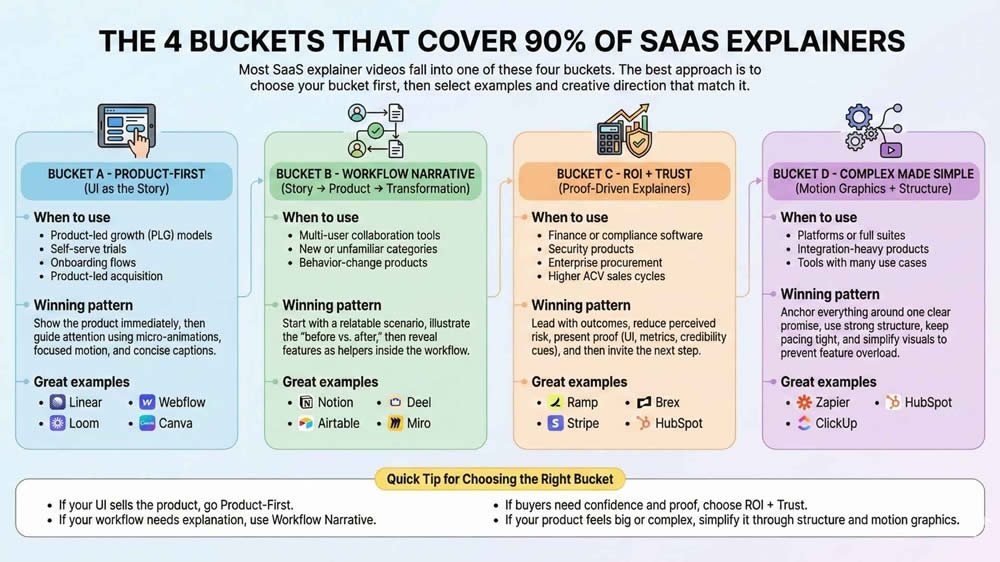
The 4 Buckets That Cover 90% of SaaS Explainers
Most SaaS explainer videos fall into one of these four buckets. The best approach is to choose your bucket first, then select examples and creative directions that match it.
Bucket A – Product-First (UI as the Story)
When to use
- Product-led growth (PLG) models
- Self-serve trials
- Onboarding flows
- Product-led acquisition
Winning pattern
Show the product immediately, then guide attention using micro-animations, focused motion, and concise captions.
Great examples
- Linear
- Loom
- Webflow
- Canva
Bucket B – Workflow Narrative (Story → Product → Transformation)
When to use
- Multi-user collaboration tools
- New or unfamiliar categories
- Behavior-change products
Winning pattern
Start with a relatable scenario, illustrate the “before vs. after,” then reveal features as helpers inside the workflow.
Great examples
- Notion
- Airtable
- Deel
- Miro
Bucket C – ROI + Trust (Proof-Driven Explainers)
When to use
- Finance or compliance software
- Security products
- Enterprise procurement
- Higher ACV sales cycles
Winning pattern
Lead with outcomes, reduce perceived risk, present proof (UI, metrics, credibility cues), and then invite the next step.
Great examples
- Ramp
- Stripe
- Brex
- HubSpot
Bucket D – Complex Made Simple (Motion Graphics + Structure)
When to use
- Platforms or full suites
- Integration-heavy products
- Tools with many use cases
Winning pattern
Anchor everything around one clear promise, use strong structure, keep pacing tight, and simplify visuals to prevent feature overload.
Great examples
- Zapier
- ClickUp
- HubSpot
Quick Tip for Choosing the Right Bucket
- If your UI sells the product, go Product-First.
- If your workflow needs explanation, use Workflow Narrative.
- If buyers need confidence and proof, choose ROI + Trust.
- If your product feels big or complex, simplify it through structure and motion graphics.
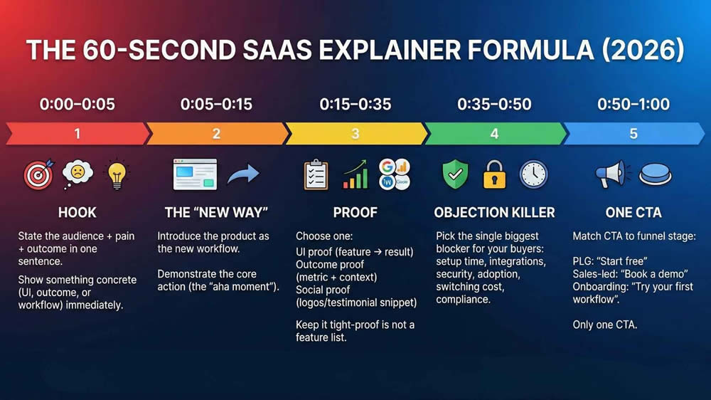
The 60-Second SaaS Explainer Formula (2026)
Use this structure to turn any product into a tight explainer without bloating.
0:00–0:05 – Hook
- State the audience + pain + outcome in one sentence.
- Show something concrete (UI, outcome, or workflow) immediately.
0:05–0:15 – The “new way”
- Introduce the product as the new workflow.
- Demonstrate the core action (the “aha moment”).
0:15–0:35 – Proof
Choose one:
- UI proof (feature → result)
- Outcome proof (metric + context)
- Social proof (logos/testimonial snippet)
Keep it tight-proof is not a feature list.
0:35–0:50 – Objection killer
Pick the single biggest blocker for your buyers:
- setup time, integrations, security, adoption, switching cost, compliance
0:50–1:00 – One CTA
Match CTA to funnel stage:
- PLG: “Start free”
- Sales-led: “Book a demo”
- Onboarding: “Try your first workflow”
Only one CTA.
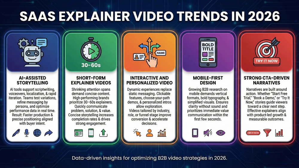
SaaS Explainer Video Trends in 2026
AI-Assisted Storytelling
AI tools now support scriptwriting, voiceovers, localization, and rapid iteration. SaaS teams use AI to test variations, refine messaging by persona, and optimize performance data in real time. The result: faster production cycles and more precise positioning aligned with buyer intent.
Short-Form Explainer Videos
Attention spans continue to shrink, especially across social and mobile channels. High-performing SaaS brands prioritize 30–60 second explainers that communicate the core problem, solution, and value proposition quickly. Concise, outcome-focused storytelling increases completion rates and drives stronger engagement.
Interactive and Personalized Video
Static messaging is being replaced by dynamic experiences. Interactive elements, clickable features, choose-your-path demos, and personalized intros, allow viewers to explore relevant use cases. Personalized videos tailored by industry, role, or funnel stage improve conversion and accelerate decision-making.
Mobile-First Design
With a growing share of B2B research happening on mobile devices, vertical formats, bold typography, and simplified visuals are essential. Mobile-first design ensures clarity without sound and prioritizes immediate value communication within the first few seconds.
Strong CTA-Driven Narratives
Modern explainer videos are built around action. Whether the goal is “Start Free Trial,” “Book a Demo,” or “Try It Now,” narratives guide viewers toward a clear next step. Effective SaaS explainers align storytelling with product-led growth and measurable outcomes.
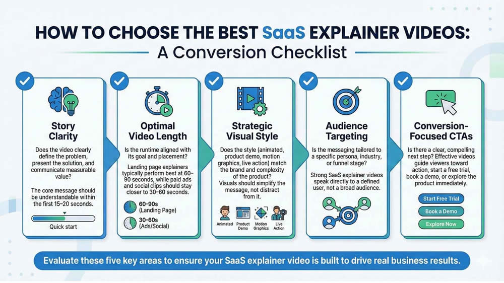
How to Choose the Best SaaS Explainer Videos
Use this checklist to evaluate whether a SaaS explainer video is built to drive real business results:
Story Clarity
Does the video clearly define the problem, present the solution, and communicate measurable value? The core message should be understandable within the first 15–20 seconds.
Optimal Video Length
Is the runtime aligned with its goal and placement? Landing page explainers typically perform best at 60–90 seconds, while paid ads and social clips should stay closer to 30–60 seconds.
Strategic Visual Style
Does the style (animated, product demo, motion graphics, live action) match the brand and complexity of the product? Visuals should simplify the message, not distract from it.
Audience Targeting
Is the messaging tailored to a specific persona, industry, or funnel stage? Strong SaaS explainer videos speak directly to a defined user, not a broad audience.
Conversion-Focused CTAs
Is there a clear, compelling next step? Effective videos guide viewers toward action, start a free trial, book a demo, or explore the product immediately.
Frequently Asked Questions (2026 Update)
1. What is the ideal length for a SaaS explainer video in 2026?
The ideal length is 60–90 seconds for landing pages and homepage explainers. For paid ads or social media, 30–60 seconds performs best. Shorter videos increase completion rates while maintaining message clarity.
2. Should SaaS companies use animated or live-action explainer videos?
Most SaaS brands benefit from animated or motion-graphics videos because they simplify complex workflows and scale easily across updates. Live-action works well for brand storytelling, thought leadership, or enterprise credibility. The best choice depends on product complexity and the target audience.
3. How much does a SaaS explainer video cost in 2026?
Costs typically range from $3,000 to $25,000+, depending on length, animation quality, scripting, voiceover, and production scope. AI-assisted production can reduce costs, but strategic scripting and positioning remain critical investments.
4. Where should SaaS explainer videos be used for the best ROI?
High-performing placements include homepage hero sections, product landing pages, paid ads, onboarding flows, and sales outreach emails. Embedding explainer videos at high-intent touchpoints improves engagement and conversion rates.
5. Do SaaS explainer videos improve conversion rates?
Yes. Clear, benefit-driven SaaS explainer videos reduce friction, increase product understanding, and support product-led growth, often leading to higher trial sign-ups and demo bookings.
Final Thoughts
The best SaaS explainer videos in 2026 do more than introduce a product, they accelerate understanding, reduce friction, and drive measurable growth. The strongest examples share common traits: clear problem-solution storytelling, concise runtimes, product-forward visuals, and strong, action-oriented CTAs. They embrace modern trends like AI-assisted production, short-form formats, personalization, and mobile-first design while staying focused on one core objective, conversion.
For SaaS founders and marketers, the lesson is clear: clarity wins. In an increasingly competitive market, the brands that communicate value fastest gain the advantage.
If your product isn’t supported by a high-performing explainer video, you’re leaving conversions on the table. Now is the time to invest in a SaaS explainer video that educates

Founder at LocalEyes Video Production | Inc. 5000 CEO | Emmy Award Winning Producer