Fast answer
Key Takeaways
- Color correction fixes and normalizes footage; color grading creates mood and a branded look. Correct first, then grade.
- LUTs are starting points, not finished looks; the grade is shaped with curves, balance, and secondaries.
- Consistent color across a campaign is a brand asset, especially for a multi-asset B2B video system.
- Grade on a calibrated display and export to the right color space for each platform.
- The most common failure is over-grading; protect skin tones, trust your scopes, and let color serve the story.
Audiences feel color long before they think about it. It is the one production choice that shapes a reaction while staying completely invisible.
You can shoot, cut, and score a brand film beautifully and still watch it read as cheap the moment the color is off. Fix that same footage and it suddenly looks considered, deliberate, and premium, without a single frame being reshot.
So why does grading matter past the film-school anecdote? Picture a team running video across a launch, or across a full year of brand video. Color is the quiet thread that pulls a dozen separate assets into one brand instead of a pile of clips that clearly came from different vendors. That is the practical stake, and it is worth real money.
What follows covers the whole arc: what grading actually is, how it splits from correction, the tools and workflow professionals lean on, how a grade gets adapted for each platform, and where teams reliably go wrong. If you commission video rather than cut it yourself, slow down on the correction-versus-grading section and the B2B section. We start with the distinction that trips up almost everyone.
What Is Color Grading, and How Is It Different From Color Correction?
Correction is technical, and grading is creative. They are two separate jobs that people constantly collapse into one word, and the order between them is not optional. Skip the first and you get the exact wrongness that makes amateur video look off in a way viewers can never quite name.
Correction: The Clean, Honest Baseline
Correction is the work of fixing footage so it reads accurate and neutral, with no style attached. Its whole job is to get every shot in a scene to the same honest starting point, and then stop there. Four moves do most of that work.
- Exposure. It sets brightness so no shot sits crushed in the shadows or blown out in the highlights.
- White balance. It neutralizes the color cast from the light source, measured in degrees Kelvin, so a white shirt reads white under warm tungsten or cool daylight.
- Color casts. It strips out the unwanted tints a scene picked up on the day.
- A shared baseline. It lands every clip in the scene on the same neutral footing, ready to grade from.
White balance is the piece most people underrate. A shot carries a cast measured in Kelvin, and correction cancels that cast so every shot in the scene shares one baseline before a look ever goes on.
Grading: Where the Look Begins
Grading only starts once that clean base exists. It pushes shadows cooler or highlights warmer, sculpts contrast into something cinematic, and layers on a color identity. The footage stops being merely accurate and starts to feel like something. These are not the same craft at all: correction makes footage correct, grading makes it mean something.
| Aspect | Color correction | Color grading |
|---|---|---|
| Goal | Fix and normalize | Create mood and a look |
| When | First | After correction |
| Tools | Scopes, white balance, exposure | LUTs, curves, power windows |
| Outcome | Accurate, consistent footage | Cinematic, on-brand image |
Do it out of order and the failure is mechanical. A strong grade laid over uncorrected footage fights itself, because the shots underneath never matched to begin with, and what you see is a look that refuses to settle no matter how long you push it. Get every clip to neutral first, then apply one look across all of them, and the whole piece holds together.
How Does Color Shape Mood and Meaning on Screen?
Color reaches an audience before a single word is spoken, and viewers read tone by instinct well ahead of processing what anyone is actually saying. That instinct is precisely why color is such a useful tool, and such an easy one to overuse.
The Warm-to-Cool Axis
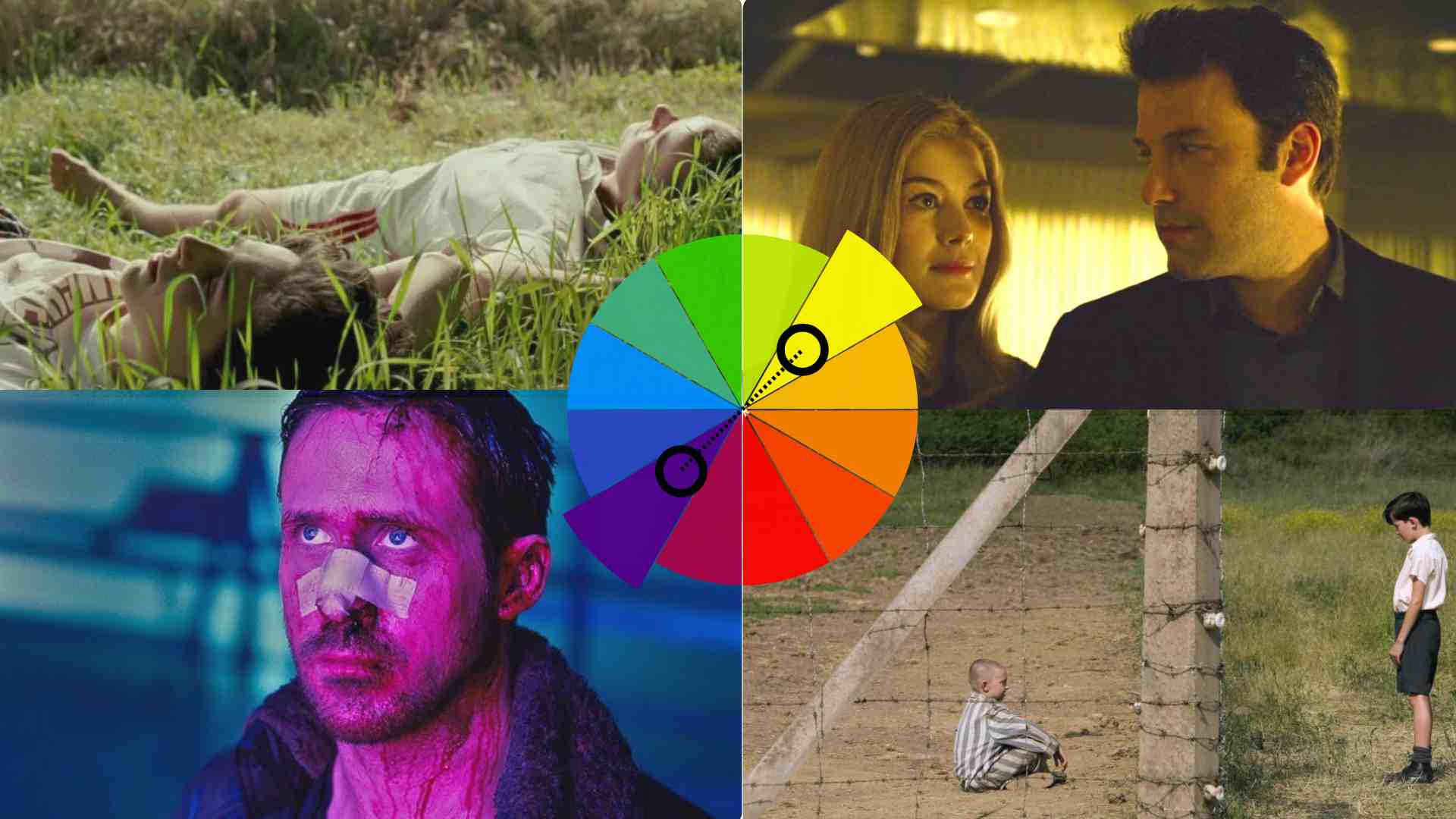
The emotional map runs on one simple axis. Warm colors, the reds and oranges and yellows, read as energy, passion, and at the extreme, aggression. Cool colors, the blues and greens and purples, read as calm, distance, or mystery. Push a scene warm and it feels alive; pull it cool and it feels reserved. Most deliberate looks sit in a controlled balance between the two.
The Three Tonal Ranges
Underneath that balance, a colorist reads the image in three tonal ranges and moves color independently across each one.
- Shadows. The darkest areas set depth and mood, so tinting them shifts how grounded or uneasy a scene feels.
- Midtones. They hold most of the detail, skin included, which is why they carry the natural or stylized character of the footage.
- Highlights. The brightest areas are where you decide whether light reads crisp and clean or soft and hazy.
Grading, stripped to its core, is that craft of steering color across shadows, midtones, and highlights on purpose rather than by accident.
The Shorthand Genres Taught Us
Genres taught audiences a color shorthand, and the pattern underneath is identical every time: each palette is a promise about the kind of story you are about to watch.
- Action. A teal-and-orange split sets warm skin against cool shadows for punch and contrast.
- Drama. Muted, natural tones keep the eye on the actors rather than the palette.
- Horror. A desaturated, cooled frame makes scenes feel lifeless and tense.
- Science fiction. Neon and high-contrast synthetic palettes feel engineered and other-worldly.
The lesson for any video, brand work included, is that a palette should follow an intention, not a trend. Decide what the piece is meant to make a viewer feel, then choose the color that carries it. Much of that intention is set on the day of the shoot, through cinematic lighting that hands the colorist something worth working with.
For brand video the same psychology holds, with one shift. The goal is rarely to copy a movie genre. It is to translate a brand’s identity into a color language that stays consistent, feels premium, and never distracts from the message.
What Do Iconic Film Grades Teach Brand Video?
The fastest way to see color doing real work is to study films whose grade you can name from a single frame. Three make the point cleanly.
- The Matrix. A green tint soaks the world so the simulation feels synthetic and unwell, carrying the film’s central idea before a line of dialogue lands.
- The Godfather. Warm sepia and amber read as old money, memory, and quiet menace at once, proof that a restrained grade can pin an entire era in the mind.
- Moonlight. Deep blues and neon render intimacy and isolation, showing a modern grade can be bold and still serve the story rather than swamp it.
None of this is a template to copy. The point is that each look was chosen to say one specific thing and then held steady across the whole film, which is exactly the discipline a multi-asset campaign needs.
What Tools and Software Do Colorists Use?
So what does professional color actually run on? Three things: reliable software, a calibrated display, and sometimes a physical control surface. Here is the encouraging part. The industry-standard tool is free to start, so the barrier is skill, not budget.
The Software Colorists Reach For
Four tools cover most of the field, from the free industry standard to the systems that run feature films.
- DaVinci Resolve. The industry standard, built around color since its origins decades ago, with node-based grading, advanced color wheels, tracking, and a full edit suite.
- Adobe Premiere Pro. Its Lumetri panel brings wheels, curves, sliders, and LUT support for the editor who wants to grade in the same place they cut.
- Final Cut Pro. It fills that same grade-where-you-cut role inside the Apple ecosystem.
- Baselight. It runs on feature films and inside large post houses, where its power earns back both its cost and its learning curve.
Resolve 21, the stable release from June 2026, is genuinely free, with a one-time 295-dollar Studio license that adds HDR grading, the Neural Engine, and higher frame rates. For most serious color work, the answer is Resolve.
DaVinci Resolve, the industry-standard grading tool
Why the Display Decides Everything
Software is only half the setup, and the display is the half that decides the outcome. Grading on an uncalibrated laptop screen is guessing, plain and simple, because you cannot trust colors you cannot see accurately. So professionals grade on calibrated, color-accurate monitors, and many add a physical color panel so adjustments feel faster and more tactile than dragging a slider with a mouse.
What a LUT Actually Does
A LUT, or lookup table, is a preset that maps one set of colors to another, and it comes in two useful flavors.
- Technical LUTs. They convert flat log footage into a standard viewing space so it can be watched normally.
- Creative LUTs. They apply a stylistic look in a single move.
You might think a good LUT is a finished look, and that is the trap. A LUT is a fast, consistent way to get most of the way to a grade, but it is a starting point, never a finish line. A good colorist loads one, then refines it by hand for the specific footage rather than accepting the preset as final.
This is what explains the price. The software is largely free or one-time, yet the craft is neither, and two colorists with the same copy of Resolve will pull wildly different results from identical footage, because grading rewards a trained eye and restraint. Professional color is priced as a service, not a tool, and the choice of colorist matters more than the choice of software. When you commission corporate video, you are buying judgment, not a license.
What Are Color Spaces and Log Footage, and Why Do They Matter?
Every grade lives inside a color space, and getting that container right is what keeps a look consistent from the timeline all the way to the final screen. A color space defines the range of colors an image can hold and how they are displayed.
| Color space | Where it is used | Best for |
|---|---|---|
| Rec. 709 | HD video and most web delivery | Where most brand video is mastered |
| DCI-P3 | Digital cinema projection | Theatrical and premium color |
| Rec. 2020 | Wide-gamut high dynamic range | HDR and future-facing delivery |
Rec. 709 is where the majority of brand video ends up mastered, while theatrical and premium high-dynamic-range work reaches for wider spaces such as DCI-P3 and Rec. 2020. The container is not a creative choice so much as a delivery one, matched to where the video will actually be watched.
Log footage is the reason color spaces come up at all on a modern shoot. Set a camera to a log profile and it records a flat, low-contrast, washed-out image on purpose. That flatness preserves the maximum range of highlight and shadow detail for the grade to work with later.
Here is the catch: that flat file is not meant to be watched as is, so the first real move in most professional pipelines is converting it into a normal viewing space, usually Rec. 709, with a technical LUT or color-managed settings. That conversion is correction, not creativity. It only gets the footage to an honest starting point before any look goes on top.
Color management is the discipline that keeps this straight when a project mixes cameras. One campaign might combine a cinema camera, a mirrorless B camera, and a drone, each recording in its own log format, and a managed pipeline maps every one of them into the same working space so the whole set can be graded to match instead of fought shot by shot. You never need to name a color space to hire well, but your crew should, because shooting in log and grading in a managed pipeline is a quiet marker of a team protecting the quality you are paying for.
What Does a Professional Color Workflow Look Like?
A repeatable workflow is what separates a deliverable-ready grade from a good-looking accident. A fixed sequence is not bureaucracy; each stage sets up the next, so the work compounds instead of unraveling halfway through. Here is the six-step sequence a professional pipeline follows, from ingest to export.
- Ingest and organize. Conform the timeline and check the color space and log format before touching a pixel.
- Balance and correct. Set exposure and white balance so every shot lands neutral and clean.
- Match shots. Make cuts within a scene feel like one continuous space rather than a set of separate takes.
- Build the creative grade. Shape the mood and look, often starting from a LUT and refining it by hand.
- Refine with secondaries. Protect skin tones, skies, and brand colors with isolated adjustments.
- Export. Deliver in the right color space and codec for each platform.
A professional color workflow
- Ingest and organizeConform the timeline and check color space and log format.
- Balance and correctSet exposure and white balance so every shot is neutral and clean.
- Match shotsMake cuts within a scene feel like one continuous space.
- Creative gradeBuild the mood and look, often starting from a LUT and refining.
- SecondariesRefine skin tones, skies, and brand colors with isolated adjustments.
- ExportDeliver in the right color space and codec for each platform.
Two of those steps carry more weight than they appear to. Shot matching is what makes a scene feel professional, because a flawless grade on one clip means nothing if the next jumps in temperature or brightness, and that includes matching every insert and every piece of B-roll to the same baseline. Secondaries are where skin gets protected, and skin is the detail audiences judge fastest.
The sequence also enforces the correction-then-grading order from earlier: steps two and three are correction, and steps four and five are grading. Color sits inside a larger video post-production workflow, and it behaves best when the stages before it are respected. Jump ahead to the creative look before the footage is balanced and matched, and the grade never quite settles.
Video that has to work?
Book a discovery call with LocalEyes Video Production and start from the goal, not the brief.
How Do You Grade for Different Platforms and Screens?
Does one grade fit every destination? No, because a film graded for a dark theater, a video graded for a living-room TV, and a clip graded for a phone in bright daylight are all solving different problems, and treating them the same leaves quality on the table.
Grading by Destination
Each destination sets its own viewing conditions, and the grade adapts to them rather than the other way around.
| Destination | Viewing environment | Grade priorities |
|---|---|---|
| Theatrical | Dark, controlled room, wide gamut, large screen | Subtle grade, rich contrast, fine detail |
| Streaming | High-end OLED TV down to a budget tablet | Standard broadcast space plus HDR variants, holds up across screens and compression |
| Social | Phones in bright, uncontrolled light | Punchy contrast, strong midtones, clear color, vertical crop |
Social is the most demanding, in a different way entirely. It gets watched on phones, often in bright, uncontrolled light, so punchy contrast, strong midtones, and clear color read best, and the vertical crop changes the framing outright. What survives a dark grading suite does not always survive a sunny sidewalk.
One habit protects all of it, and you can apply it on the next project: check the grade on more than one screen. A shadow detail that looks perfect on a calibrated reference monitor can vanish on a cheap display or a phone. Grade on a proper reference monitor first, then review the result on a laptop, a TV, and a phone to catch what no single screen reveals. Broadcast-safe checks and correct color-space export finish the job, so the color the client approves is the color the audience actually sees.
For a brand running the same story across YouTube, LinkedIn, a website, and paid social, this is where consistency gets won or lost. The look should feel like the same brand on every screen, even when the technical grade is adapted for each one. That consistency is a prerequisite you set early, not a lucky default, which is why it belongs in the plan from the start. Getting the footage right at the source, in raw or log formats with maximum flexibility, is what makes a clean multi-platform grade possible later.
What Are the Most Common Color Grading Mistakes?
Most color problems are not exotic. They are a short list of predictable mistakes, and knowing them is the fastest way to raise the floor on any video, whether you grade it yourself or hire it out.
- Over-grading. Pushing curves, wheels, and saturation until the image looks dramatic, and reads as plastic instead. The fix is to build the look, step away, then return with fresh eyes, because the effect is almost always stronger than it needs to be.
- Ignoring the scopes. Your eyes adapt and lie, especially after hours inside a project. Waveform monitors, vectorscopes, and RGB parades are the objective safety net that tells you what the image is really doing, and skilled colorists read them constantly.
- Skipping shot matching. One beautifully graded shot beside a mismatched one drags the eye straight to the cut and makes the whole piece feel unfinished, in a way audiences feel instantly even when they cannot name it.
- Forgetting the story. Color exists to support the message, not to show off the grade, so the moment a look pulls focus from the product or the person on screen, it has failed no matter how impressive it looks in isolation.
That last one undoes technically flawless work, which is why every choice should trace back to the storytelling the video was built to carry. And protect skin tones through every one of those steps, because unnatural skin is the first thing a viewer notices and the last thing they forgive.
Why Does Color Grading Matter for B2B Brand Video?
For a marketing team, color grading is not a film-school flourish. It is one of the levers that decides whether video looks like a real investment or a stock clip, and both judgments land in the first second, before a viewer has processed a word of the script.
If you remember one thing about color in a B2B context, make it consistency. A brand rarely ships a single video. It ships a system, usually produced across different shoots, locations, and even cities.
- A hero film. The flagship piece that sets the brand’s visual standard for everything else.
- Product explainers. The clear, repeatable assets that carry the offer across the funnel.
- Customer stories. The proof pieces where credibility matters as much as polish.
- Social cutdowns. The short versions that have to hold the same look on a small, bright screen.
Color is what unifies them. When every asset shares a deliberate, documented look, the campaign reads as one brand with one standard. When the color drifts from asset to asset, the whole program feels improvised no matter how strong any single piece is.
Anyone can apply a LUT. A production team that treats color as a brand asset builds a consistent grade into the plan, protects it across platforms, and ships it as part of the deliverable, which is the same discipline that runs through a serious video production process from end to end.
So here is what to expect from the team you hire. You should not have to grade the footage yourself, but you should expect them to treat color as strategy, keep it consistent across every asset and every screen, and explain the look before they build it. That is the line between a vendor and a real brand video production partner.
Color that serves the brand and the story, applied with restraint and held consistent across a campaign, is one of the quiet things that make B2B video worth what it costs, and one of the easiest wins to measure against real ROI once the whole system pulls in one direction.
Video that has to work?
Book a discovery call with LocalEyes Video Production and start from the goal, not the brief.
Frequently Asked Questions
What is the difference between color correction and color grading?
What is a LUT?
What software do professionals use?
What is log footage, and why is it flat?
Does color grading matter for B2B brand video?

Founder at LocalEyes Video Production | Inc. 5000 CEO | Emmy Award Winning Producer